 MortarDesk
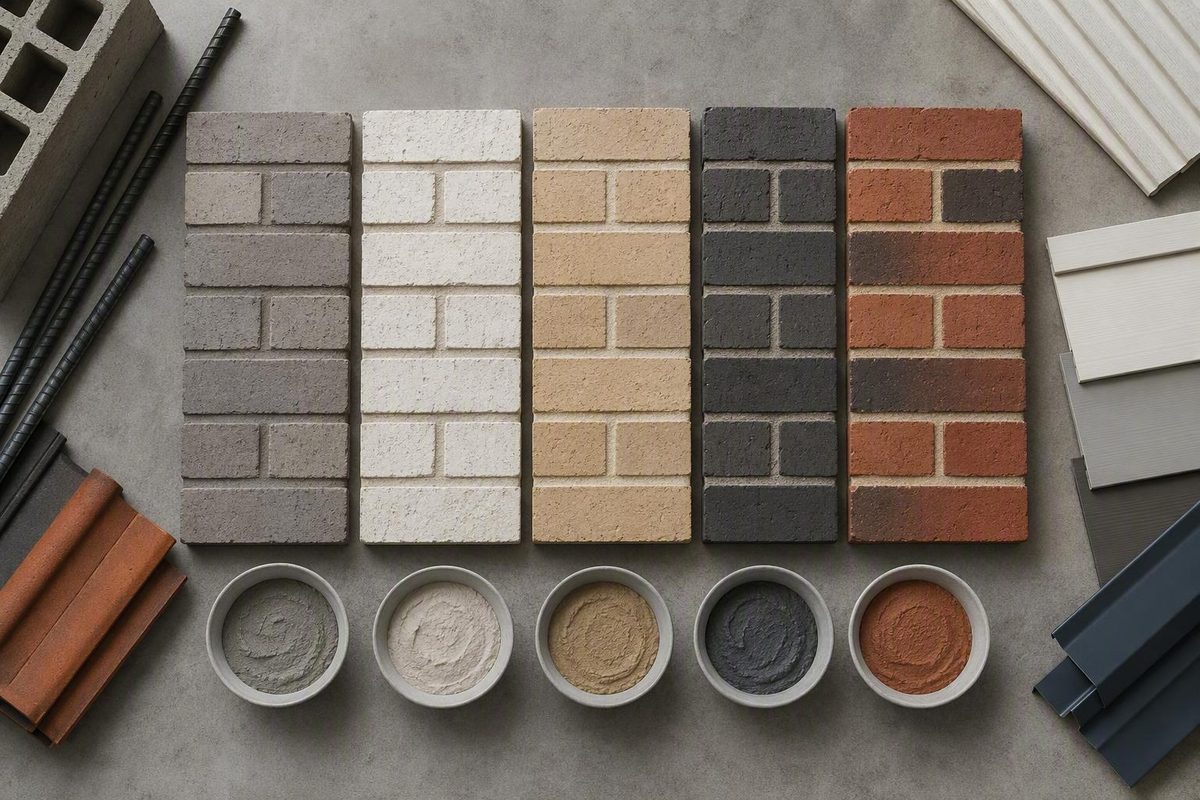
Choose brick mortar colors in two stages. First, decide whether the joints should blend with the brick, accent one of its undertones, or contrast with it. Then turn that visual choice into an orderable specification covering the actual brick, mortar type, sand, binder, pigment, joint profile, tooling, and an approved physical sample panel. A color name alone is not enough.
Quick answer: choose blend, accent, or contrast
The simplest way to narrow the options is to choose the relationship you want between brick and joint:
- Blend: Select mortar close to the brick’s dominant color. This reduces the apparent joint grid and makes the wall read as a more continuous field.
- Accent: Select mortar that picks up an undertone already present in the brick. Buff may draw out tan or brown notes, while gray may bring cooler tones forward.
- Contrast: Select a clearly lighter or darker mortar. This makes individual units, edges, and the bond pattern more prominent.
As a general visual tendency, light mortar becomes conspicuous against dark brick. Charcoal or black mortar can strongly outline light brick, while dark mortar against dark brick may produce a more blended field. These are starting points rather than fixed pairing rules. The result depends on the exact brick, its color variation and texture, the joint profile, and the workmanship.
Mortar occupies a substantial visible part of brickwork, but published estimates differ. Solomon Colors gives a range of 7% to 20% of the visible surface for most masonry walls, while General Shale gives roughly 18% to 24% for brick walls. Around one-fifth is therefore a useful approximation, not a universal percentage. See the respective estimates from Solomon Colors and General Shale.
There is no universally best pairing. A highly varied brick may respond differently from a uniform brick of the same nominal color, and changing the joint profile can alter how prominent the mortar appears. Choose the desired degree of contrast first, then judge the complete brick-and-mortar assembly.
Brick mortar color comparison table
Use this table to identify two or three color families worth sampling. It describes broad visual tendencies, not the final installed color.
| Color family | Typical visual effect | Combinations worth sampling | Cautions |
|---|---|---|---|
| Gray | A neutral baseline that can leave brick variation prominent or reinforce cool gray notes | Red, pink, gray, brown, or multicolored brick | “Gray” varies by supplier, binder, sand, and pigment; it may be cool, warm, light, or dark |
| White or off-white | Creates strong contrast with dark brick and can visually connect masonry with light trim | Dark red, brown, charcoal, gray, or white brick | Bright joints may dominate the wall; white, ivory, porcelain, and off-white are not interchangeable product names |
| Buff or beige | Can emphasize cream, tan, gold, or brown undertones | Multicolored red, brown, cream, or warm gray brick | May mute cooler notes or appear more yellow beside some bricks |
| Charcoal or black | Sharply defines light brick and the bond pattern; can blend into darker brick | White, cream, pale gray, dark gray, or black brick | High contrast makes joint alignment and workmanship especially visible |
| Red or brick-toned | A close match reduces the apparent joint grid and creates a more continuous field | Red, burgundy, brown-red, or varied red brick | A near-match with the wrong undertone may be more noticeable than deliberate contrast |
Dark joints around light brick behave like outlines, making running bond, stack bond, headers, arches, and other patterns more legible. Brick-toned mortar works in the opposite direction: the closer the match, the more the masonry tends to read as a unified surface.
Commercial palettes show how broad these categories can be. Documented proprietary names include ivory, natural gray, buff, taupe, and charcoal, among many narrower white, beige, red, brown, gold, and dark variations. These names demonstrate the available range; they must be tied to a particular supplier and product rather than treated as universal color codes. One example is the Pointing Mortar Color Channel Sample Set.
Why a mortar color name does not predict the finished color
“Buff,” “ivory,” “natural gray,” and “charcoal” identify broad color families. They do not establish equivalent colors across suppliers. Even within one supplier’s range, the name must be tied to the exact product code and intended mortar formulation.
The finished appearance comes from a combination of materials and workmanship rather than the pigment label alone:
- Sand: Its inherent color, particle appearance, and gradation affect both color and texture.
-
Binder or cement: Different cementitious materials can provide different base colors.
-
Certain admixtures: Some can affect mortar color as well as other properties.
- Joint profile and tooling: These change the exposed surface, texture, shadow, and visual prominence of the mortar.
Sand deserves particular attention. Its particles remain visible in the finished joint, influencing whether the mortar appears smooth, granular, warm, cool, uniform, or varied. This becomes especially important when matching existing work: a broadly similar buff pigment cannot compensate for obviously different sand.
Joint profiles can also produce different visual effects even when the mix remains unchanged. The profile and tooling method therefore belong in the appearance specification.
This creates an important purchasing distinction:
- Color selection: “We prefer a warm buff that accents the brick’s brown undertones.”
- Reproducible specification: “Use this supplier and color code with this mortar type, binder, sand source, pigment dosage, joint profile, tooling method, and approved panel.”
The first statement communicates design intent.
Use physical samples before placing the order
Website visualizers and printed charts are useful for rejecting obvious mismatches and narrowing a large palette, but they cannot guarantee installed color. Screens, browsers, lighting, material lots, and individual color perception can alter a comparison. General Shale expressly describes its displayed colors as references for selection and contrast rather than exact matches and recommends inspecting a physical sample before purchase.
Use this workflow before committing to the full order:
- Obtain the actual brick. Use the intended manufacturer, product, color, size, and texture—not merely a similar red or gray brick. Use the intended lot where practical.
- Choose two or three mortar combinations. Compare complete combinations that include the intended sand and binder, not loose pigment swatches alone.
- Inspect physical samples beside the brick. View them where the masonry will be installed and alongside important trim or adjacent materials.
- Build a representative job-site panel. Use the intended brick, sand, mortar color, joint profile, and tooling.
- Approve the complete assembly. Judge the wall effect rather than an isolated strip of mortar.
- Record the accepted combination. Keep the details with the purchase documents and project records.
A physical channel or mortar sample is more useful than a screen image, but it still does not reproduce the complete wall. Manufacturer guidance likewise recommends comparing two or three combinations in job-site sample panels before making the final selection.
Record at least:
- Brick manufacturer, product name or code, size, texture, and relevant lot information
- Mortar-color supplier and exact color code
- Required mortar type
- Sand source and description
- Binder or cement product
- Pigment manufacturer, product, and dosage
- Joint profile
- Tooling method
- Identification or photographs of the approved panel
- Approval record and purchasing documents
The available guidance does not establish one universal panel size, curing period, inspection condition, or numerical color tolerance for every project. Set project-specific approval requirements before broad installation rather than deciding what is “close enough” after the wall has been built.
Keep color, mortar type, and performance as separate decisions
Choosing a mortar color does not determine the correct mortar type, strength, exposure suitability, or compatibility. Black mortar is not inherently one mortar type, and white mortar is not inherently another. Do not select Type N, S, M, or O based on appearance alone.
A buyer-facing specification should keep each decision in its own field:
| Specification field | What to record |
|---|---|
| Brick | Manufacturer, product or code, dimensions, texture, and relevant lot information |
| Mortar requirements | Required type and governing property or proportion specification |
| Aggregate | Sand source, color, and applicable grading requirement |
| Binder | Cementitious-material manufacturer and product |
| Color | Pigment manufacturer, product code, and specified dosage |
| Finish | Joint profile and tooling method |
| Approval benchmark | Accepted physical panel and approval record |
The Brick Industry Association recommends mortar satisfying applicable ASTM C270 requirements, aggregate covered by ASTM C144, and pigments complying with ASTM C979, as detailed in its technical note on mortars for brickwork. Verify the applicable standard editions, project specifications, contract documents, product data, and locally enforced requirements rather than treating this article as a project specification.
Separating these fields prevents two common ordering errors. The first is approving a color and assuming the resulting mix must be suitable for the wall. The second is changing the binder, sand, pigment, or production method later while expecting the approved appearance to remain reproducible. Appearance and performance both depend on the materials, but they are not the same decision.
Pigment limits and batch-consistency controls
The Brick Industry Association’s technical guidance gives the following maximum pigment limits:
- Metallic oxide pigment: 10% of cement content by weight
- Carbon black pigment: 2% of cement content by weight
- When used with mortar cement or masonry cement: reduce the applicable limit by half
These are ceilings, not formulas for producing gray, buff, charcoal, black, red, or any other target color. The same guidance recommends ASTM C979-compliant pigments and using as little pigment as possible. See the BIA pigment and mortar guidance.
A dosage cannot be transferred automatically between pigments, binders, batch sizes, or mortar formulations. The supported consistency controls are:
-
Premix cement and coloring agents in large, controlled quantities.
-
Do not retemper colored mortar.
Consistency starts with an approved formulation, not a field correction made by eye.
Manufacturer dosage tables require the same discipline. A proprietary “color unit” may be formulated for a stated product, ingredient quantity, and batch size. Do not apply that unit count to another manufacturer’s pigment, a different batch volume, or a different cement-and-lime system. Confirm the instructions for the exact pigment and mortar formulation being purchased.
Matching mortar for repairs and historic brickwork
Repair work is different from selecting a decorative mortar for new brick. The goal is to reproduce relevant characteristics of the existing joint while maintaining physical compatibility with the masonry—not to choose a new contrast from a color chart.
Where possible, use an unweathered portion of the original mortar as the visual reference. An exposed joint face may be stained, eroded, or otherwise unrepresentative. Protected material within a joint or in another sheltered location can provide a better reference, subject to an appropriate investigation method.
Match more than the apparent surface color:
- Sand color and particle appearance
- Sand gradation
- Mortar color
- Texture
- Joint profile
- Tooling
- Relevant physical properties
Sand matching is central because sand contributes color, particle character, gradation, texture, and cohesiveness.
Visual matching alone is insufficient. For historic masonry, replacement mortar should be softer and more vapor-permeable than the masonry units. Relative to the historic mortar, it should be as vapor-permeable and as soft as, or softer than, the original. National Park Service guidance also calls for matching color, texture, and tooling and testing proposed work before proceeding broadly; these relationships are set out in Preservation Brief 2 on repointing historic masonry.
A qualified laboratory can help identify original ingredients and characterize sand gradation and color. It cannot fully reconstruct the original water content, sand condition, mixing method, curing conditions, or installation practices. Laboratory analysis is therefore an input to the repair specification, not a complete recipe.
Before repointing, correct the cause of deterioration where possible. The National Park Service specifically identifies problems such as leaking gutters or downspouts, settlement, and rising damp as conditions to address before repair. After that work, install a test patch and evaluate its color, texture, tooling, and physical suitability before extending the repointing across the wall. See the NPS repointing guidance.
Before ordering, use one rule: choose blend, accent, or contrast; approve the actual brick and mortar together in a physical panel; then record the complete specification. For repairs—especially historic work—match more than color. Sand, texture, tooling, softness, and vapor permeability also matter.